About the project
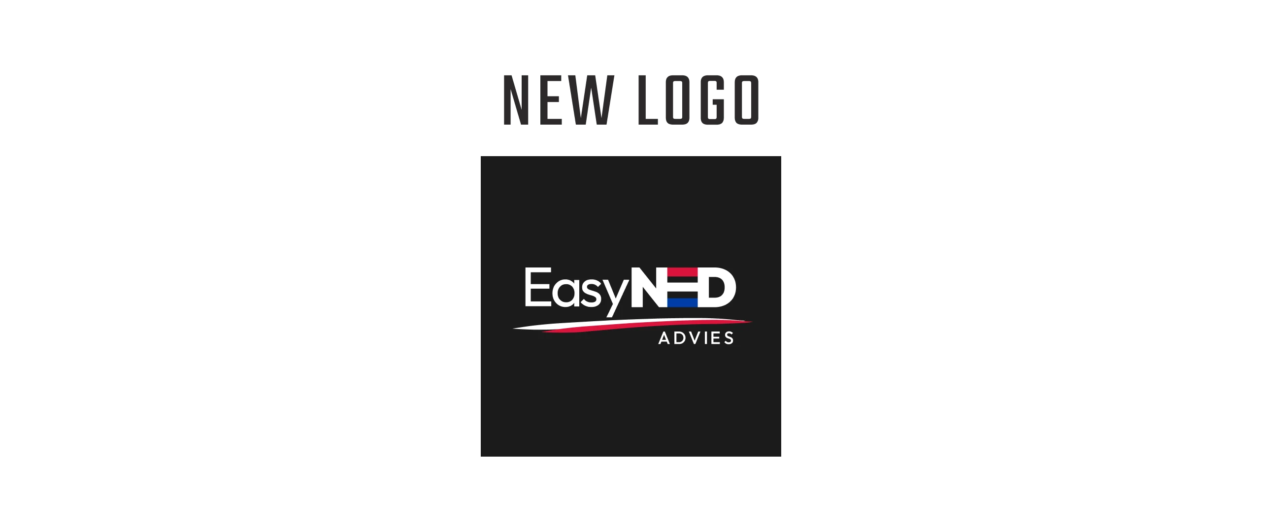
EasyNED Advies had been using the same logo for around 15 years. It mixed three different typefaces, and the colours and composition needed sorting out. Instead of starting over, I refreshed the existing mark so it stays recognisable and keeps its reference to the Dutch flag. Outfit, in a few weights, replaced the three fonts, and the joined letters NED became the detail that gives the logo its own character. After a conversation with the client, I added a hand-drawn line to make the cleaner type feel lighter.
scope
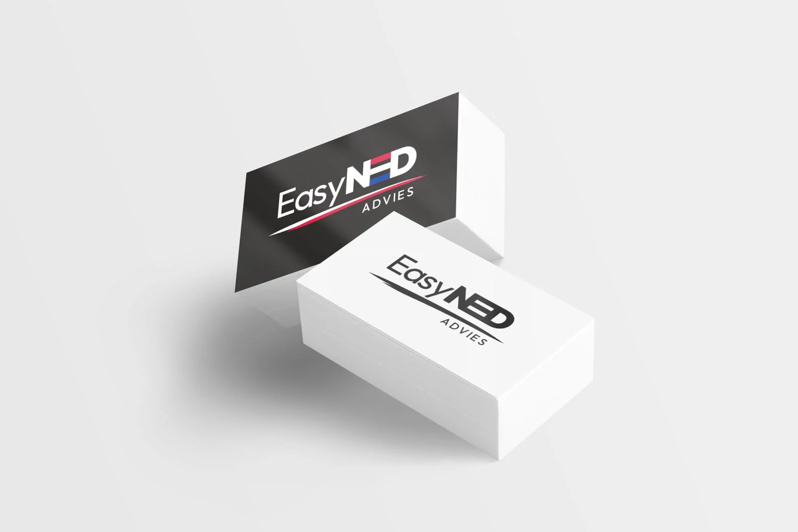
Logo refresh, business card
tools
Figma
timeline
2025